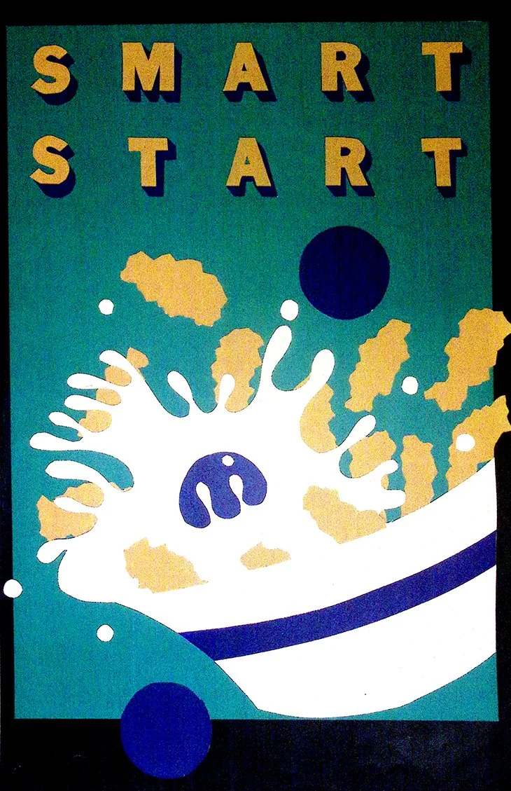
Nostalgia repackaged with intent. At first glance, it reads like a vintage cereal box. Bold lettering, playful color, and simplified forms echo the visual language of classic American brands, where optimism was designed to be consumed first thing in the morning. “SMART START” promises something clean, wholesome, even aspirational.
But beneath that polished surface, the imagery shifts. The exaggerated splash, frozen mid-burst, introduces a sense of chaos that undercuts the promise of control. What should feel orderly and “smart” instead feels explosive, almost uncontrollable. The design mimics the certainty of advertising, while quietly questioning it.
The retro aesthetic is doing more than styling. It taps into a familiar trust. These are the visuals people associate with reliability, routine, and simplicity. Yet the composition suggests that even the most carefully branded beginnings carry unpredictability beneath them.
There’s a subtle tension between packaging and reality. The box presents clarity, but the image reveals motion. It hints that what we are sold as a perfect start is often far messier in practice.
In that way, the piece becomes both homage and critique. A nod to the comfort of classic branding, and a reminder that even the most “smart” beginnings rarely unfold as neatly as they’re advertised.