Presented as a full sales package, this series of designs moves beyond a single work and into a system of communication. Letterhead, mapping, informational sheets, and brand storytelling all work together to construct not just a company, but credibility. It’s not one message. It’s repetition, consistency, and coverage.
The visual language is bold and unmistakable. Gradients, bright color transitions, and clean layouts signal optimism and accessibility. There is a deliberate friendliness in both tone and design. The brand is not trying to intimidate. It is trying to be understood, remembered, and trusted.
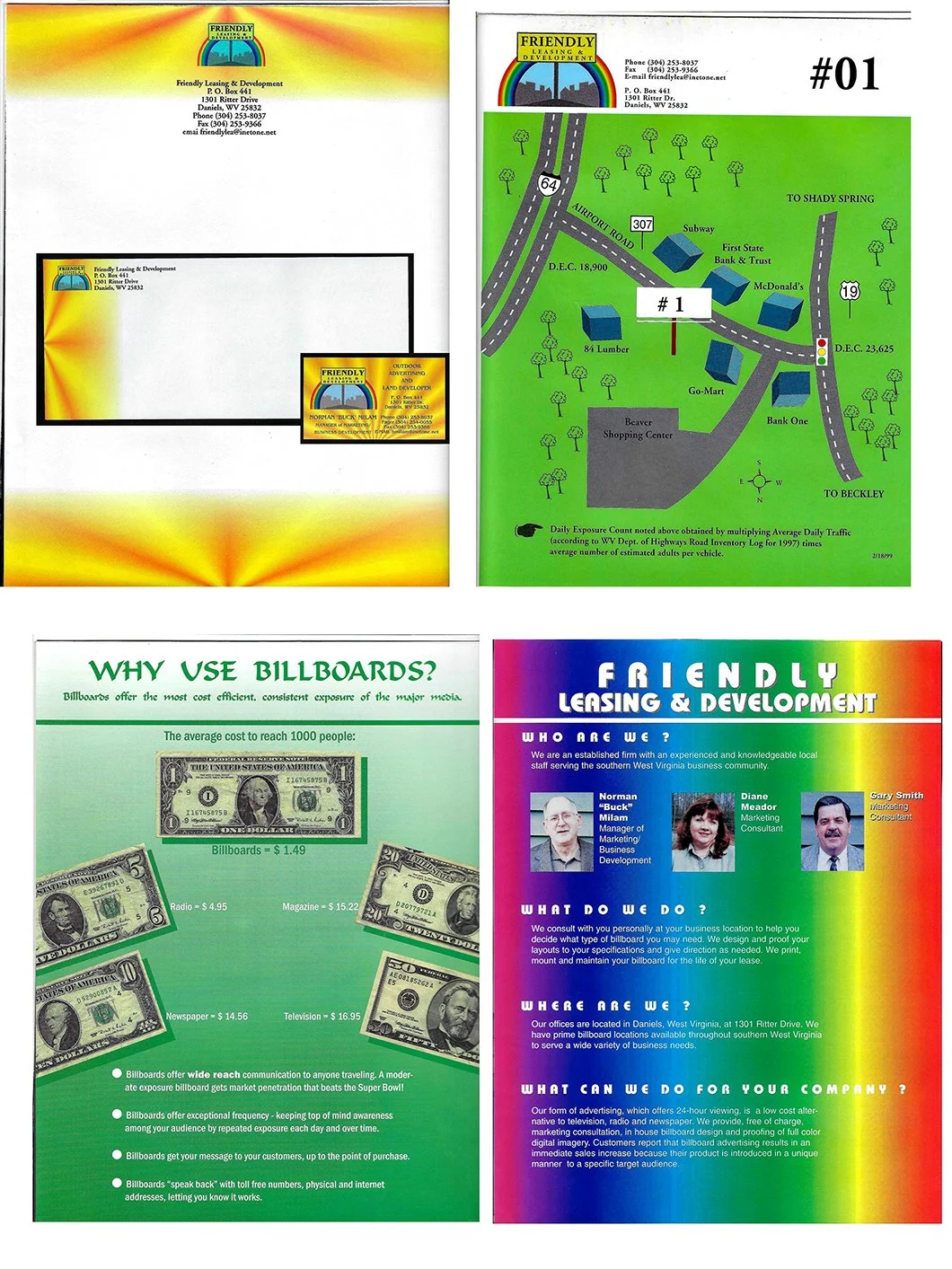
What stands out is how directly the materials speak. Costs are compared plainly. Benefits are listed clearly. Locations are mapped out with precision. There is very little abstraction. The goal is clarity over cleverness, function over subtlety.
At the same time, the piece reflects a specific era of marketing. One where information density was a strength, not a liability. Where persuasion came from, showing everything, not hiding behind minimalism. It assumes the viewer wants to understand the full picture before making a decision.
In that way, the work becomes more than collateral. It becomes a snapshot of how businesses once built trust. Through visibility, repetition, and a belief that if you explain enough, the value becomes undeniable.