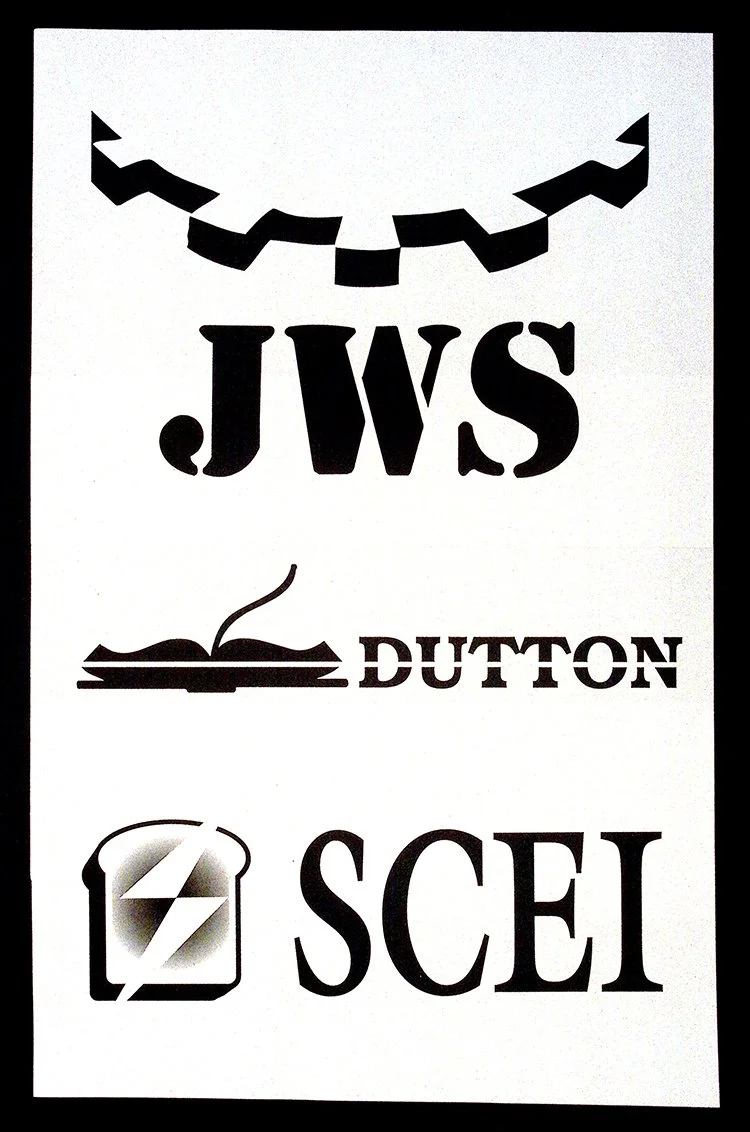
Stripped to black and white, the work presents a series of logo explorations that sit somewhere between concept and conclusion. Each mark is reduced to its most essential elements. Shape, type, and symbol are doing all the work. There is no color to persuade, no embellishment to distract.
What stands out is the variety of visual languages being tested. “JWS” carries a sense of strength and structure, its weighty type paired with a sharp, almost abstract form above it. “Dutton” introduces a quieter tone, leaning into tradition and intellect through the open book motif. “SCEI” shifts again, more modern, more geometric, with a symbol that feels engineered rather than illustrative.
Together, they read less like finished brands and more like questions. What does identity look like when reduced to form alone? How much meaning can be carried through silhouette and spacing?
There is a discipline in the restraint. By removing color and context, the piece forces each concept to stand on clarity alone. It becomes a study in decision-making. In how identity is built, tested, and refined before it is ever seen in its final form.
In that way, the work captures something rarely shown. Not the brand itself, but the thinking behind it.