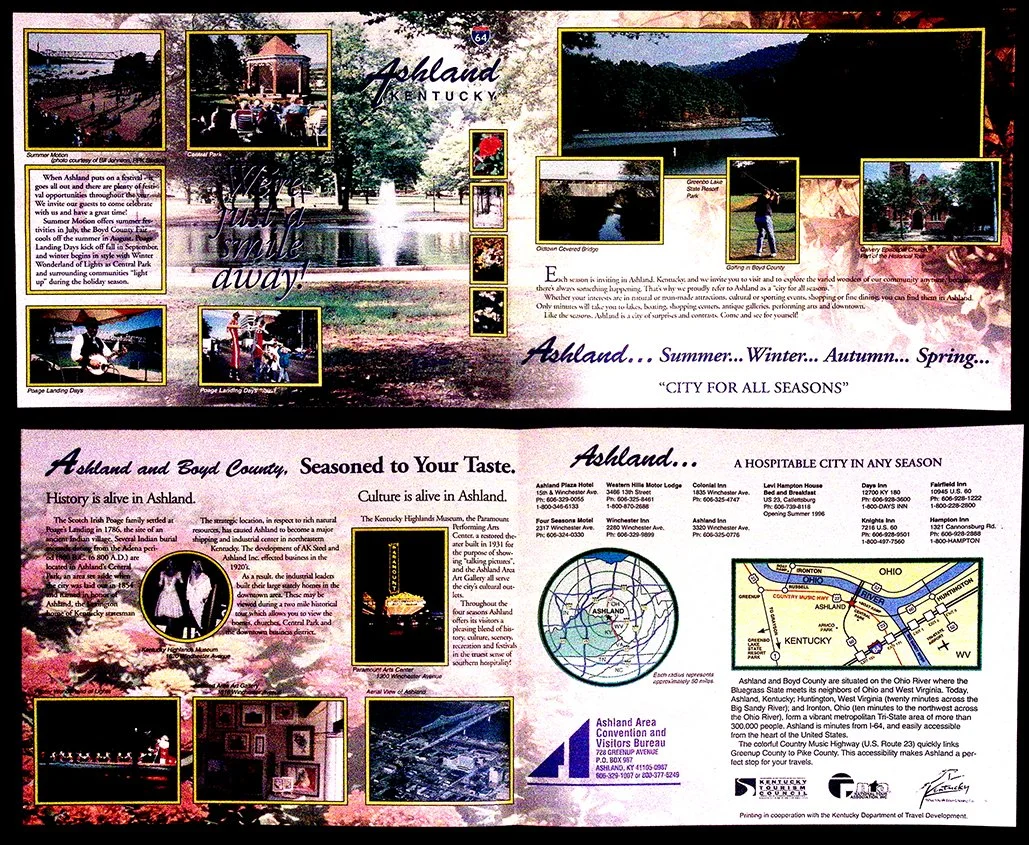
A snapshot of how places marketed themselves before the world went digital.
It’s dense on purpose. Photos boxed in yellow, multiple typefaces, gradients, drop shadows. Nothing is subtle because subtle didn’t work here. This had to compete in a rack, grab attention, and answer every question without a website.
The design leans heavily on reassurance. You see the town, the events, the landmarks, the map, the seasons. It’s all there. Not curated, just presented. The goal isn’t aesthetic clarity, it’s coverage.
There’s also a kind of optimism baked into it. Bright colors, scenic shots, phrases like “City for All Seasons.” It’s selling not just a location, but a feeling of reliability. A place that has something for everyone, all the time.
It reflects a moment where information was physical, finite, and front-loaded. If it didn’t fit on the page, it didn’t exist.